

We’re UNCLE.
We’re changing the status quo of renting.
A rental agreement that you actually agree with? Yup. Taps that’s don’t leak, but they do we actually fix them? Sure. Designer furniture? That’s on us.
We believe renting a home should be easy, not exhausting. That’s why we started UNCLE.
Our on-site property managers take care of the nuts and bolts (literally), so you’ve got more time to get busy living.
It’s renting as it should be.
We’re not your mum, but we’re not your absentee landlord either. Find the sweet spot in between those two things, and you’ll probably be in UNCLE territory.
UNCLE isn’t an online portal or an estate agency. We own and operate all of our properties ourselves.
We care about our tenants (we actually call them residents), but we don’t take ourselves too seriously either.
We’re responsive and trustworthy. And we communicate – it’s important we get that bit right.
In short, we’re in this for the longhaul. UNCLE is part of the Realstar group of companies which has been in the rental and hotel game for over 45 years. In fact, the firm still owns the first building it built in Canada in 1974!
We think the brand rental sector today is where the hotel sector was in the 1960s. Like Hilton or Marriott (but cooler and more fun) UNCLE’s vision is to have a presence in every major global city.
We believe that you should always treat others as you wish to be treated. That means that people of every age, race and background are created equal and should be treated that way. Lastly, say it like it is. Even when we mess up, we fess up.
That doesn’t mean we’re not kind or don’t make it simple to rent. It means that our job is not only to make residents happy, even they’re in breach of contract. It means we’re here to create a new category of renting.
And that’s what we can promise our customers and future customers at every interaction.
Property has a bad rap. With these pillars, we build trust. And with trust comes a brand that will last.
Since we set up shop in 2002, we’ve used these promises to inform everything we do. And we keep them.
We’ll always strive to do right by our stakeholders. At UNCLE we see life as a two-way street. We expect you’ll do right by us too. We go out of our way to bring (tears of) joy to our residents, but we know we’re not perfect. We just hope our residents appreciate that when we’re honest about our mess-ups.
UNCLE needs to find its voice in a marketplace where everyone sounds and looks the same.
Bye-bye bullshit.
By this we mean to call out the nonsense, half truths and skullduggery surrounding the rental market. We’re not sneaky, there are no hidden fees, no jargon, no bullshit! We do this with a simple straight-forward, honest, no-nonsense approach to renting, by offering a transparent, fair and simpler process.
The yellow and purple will only be used as text colours to add vibrance when necessary e.g. press ads.
Pastel Red
RGB - 255, 107, 97
CMYL - 0, 70, 54, 0
Hex - #FF6B61
Pale Cyan
RGB - 0, 153, 204
CMYL - 80, 20, 0, 20
Hex - #0099CC
Hunter Green
RGB - 51, 101, 47
CMYL - 81, 36, 96, 29
Hex - #33652F
Space Grey
RGB - 71, 71, 70
CMYL - 0, 0, 0, 86
Hex - #474746
Timberwolf Grey
RGB - 218, 218, 218
CMYL - 0, 0, 0, 20
Hex - #DADADA
Titanium Yellow
RGB - 255, 237, 0
CMYL - 0, 0, 100, 0
Hex - #FFED00
Iris Purple
RGB - 99, 70, 222
CMYL - 80, 75, 0, 0
Hex - #6346DE
Lota Grotesque is our brand font. Its modernist quality depicts a straight-forward tone and playful flourishes give it a playful, approachable feel.
We use Lota Grotesque bold for headlines and Lota Grotesque regular for body copy. Please refer to application examples further in the document for examples of use.
Aa
ABCDEFGHIJKLMNOPQRSTUVWXYZ
abcdefghijklmnopqrstuvwxyz
!@£$%^&*
Standard UK grammar will do just fine. But don’t get caught up in the details – no one’s getting fired over an apostrophe. (Except you. You might.)
Acronyms
Apostrophes
Bullet Points
Capitalisation
Contractions
Italics
Numbers
Punctuation
Sentence length
Spelling preferences
Starting things off
Text alignment
UNCLE has a personality to live up to, and the way we say things is going to play an important role in that. Here’s a few pointers to remember when it comes to the tone of your communications.
Be direct
Let the reader be visible
It’s okay to be familiar
Be wry
Swearing and sauciness
Metaphors and analogies
Fairness and inclusivity
A lot of the stuff outlined in previous sections applies to digital content. But, here are a few things that are specific to content you’re publishing online…
Writing out web addresses/URLs
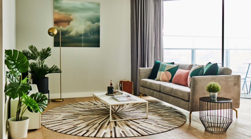
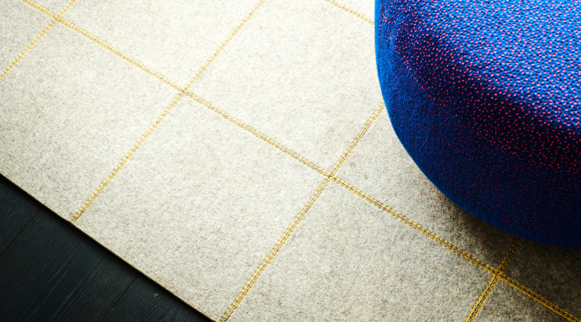
Using as much natural lighting as possible to make our spaces feel natural and inviting.
Shots from the outside looking in to spaces feels candid and creates intrigue.
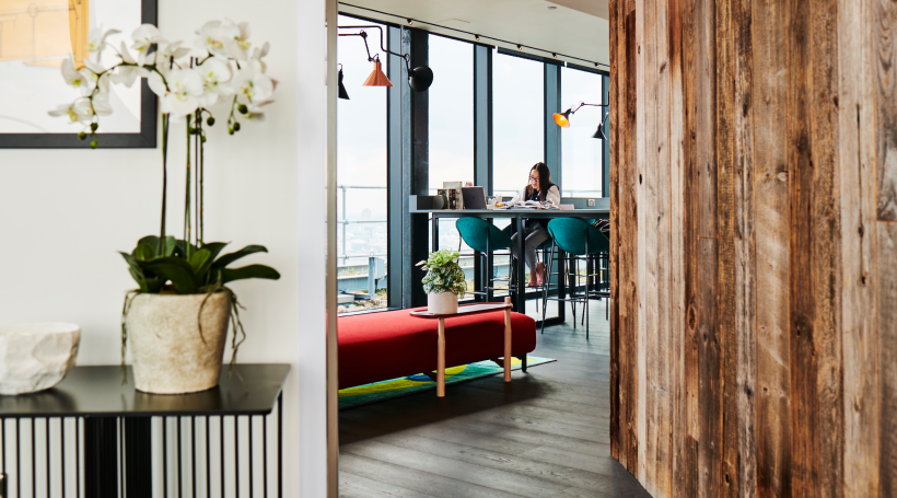
Highlighting details that feel interesting and premium.
To mix it up, some of our campaigns should be typographic. This is also useful when we want to draw more attention to the headline, or when we have tight deadlines.
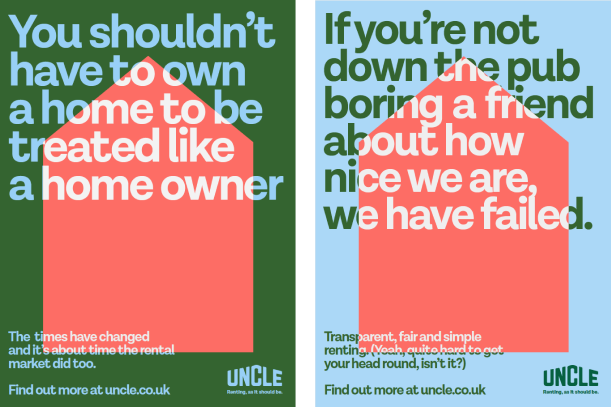
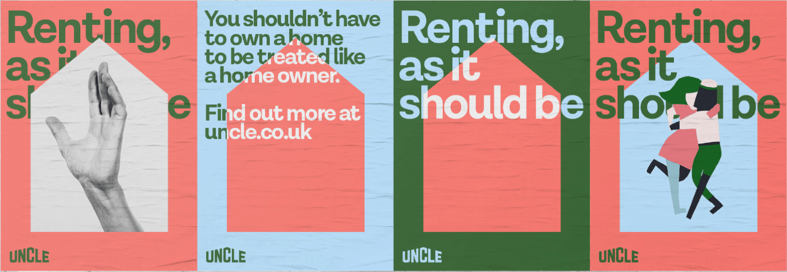
This image encapsulates all of the different ways the UNCLE home graphic can be used for expression. It is up to the designer to decide what goes on within the home graphic depending on the intention of the communication. The wider house shape should be used for landscape applications only.
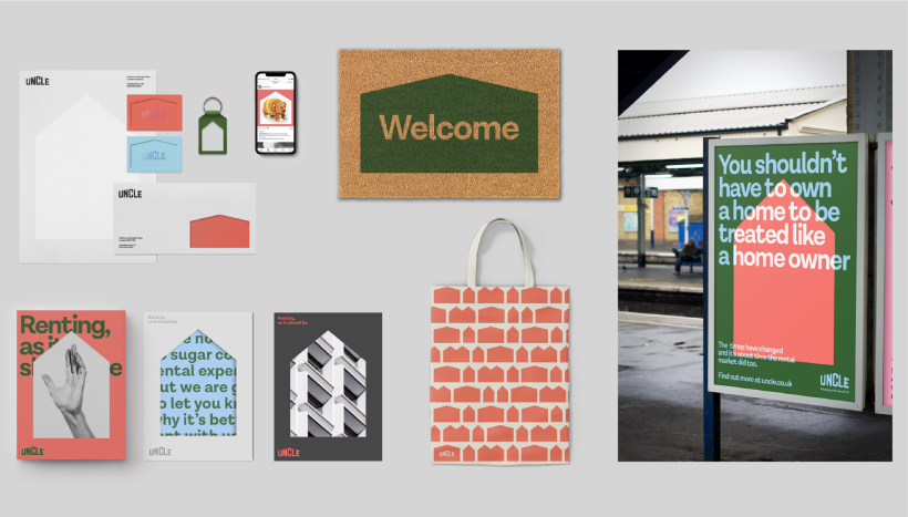
This OOH poster ran at Southall train station pre-PC to help introduce the UNCLE brand & our core values to a brand new area. It provides a good example and base for future train station advertising:
• clear brand visual identity
• clear message with our unique tone of voice (and a bit of cheek)
• clear CTA
• on brand logo and tagline
Examples of the branded flags we created for the Wembley high street leading to the opening of UNCLE Wembley & examples of other creative considered.
For specific events, we can be flexible and break the creative palette. Informative and to the point copy combined with playful imagery to bring a bit of personality.
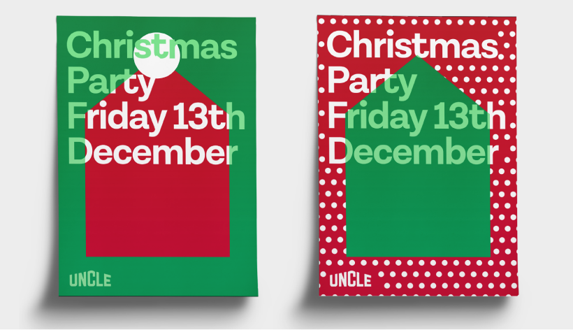
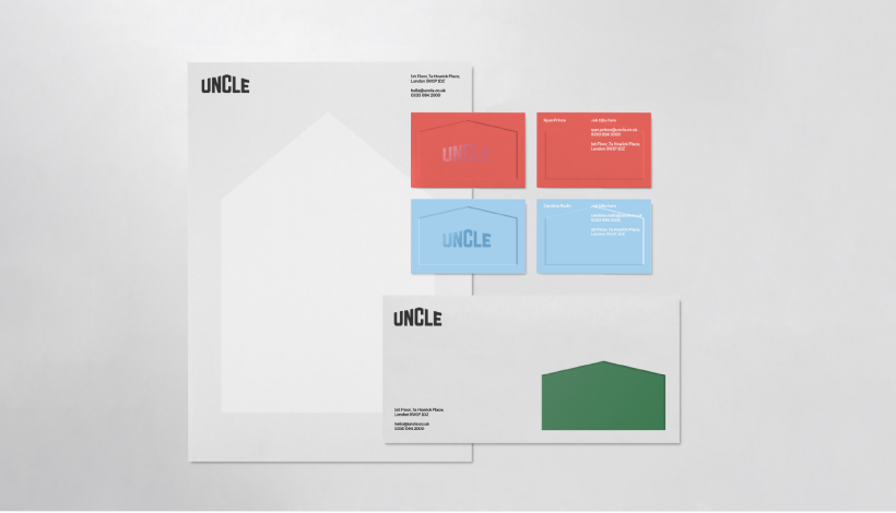
Keeping colours singular for each piece and using finishes to create sophistication.
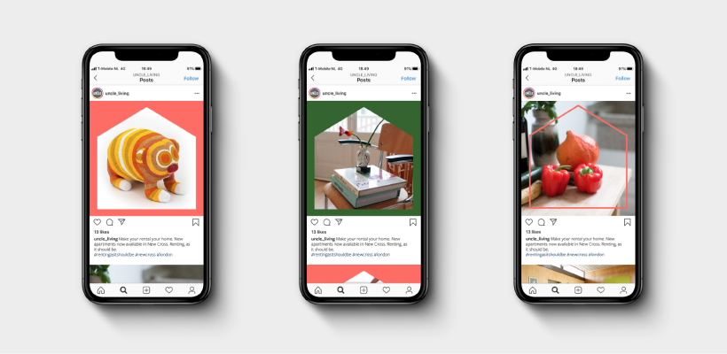
Using the house frame to make our Instagram imagery feel ownable and consistent.
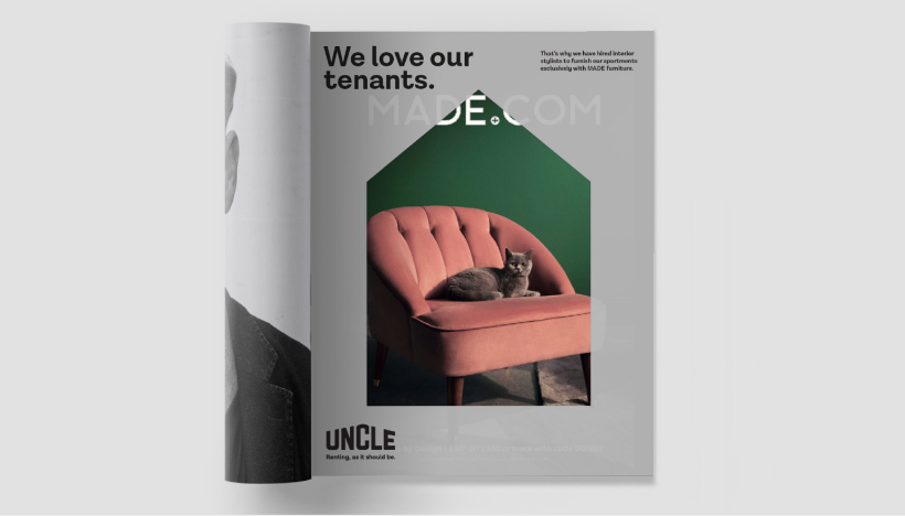
UNCLE prints a die-cut insert to be placed in front of Made.com ads. This is a good way to announce brand partnnerships.
